Lunes, Setyembre 2, 2013


In activity #7 which is creating a calling card design using  vector tools. While doing it, I really find time in deciding what color combination that I will use for the background, text and other designs then I end up with the combinations of blue as the dominant color and a mixture of a brighter shade of blue. Then for the text I used black and white for the text to be visible as well as I used the same color for the other designs.

I'm that so naughty that I used a brush tool in some designs to make it more cool and awesome.
Overall, I find the activity interesting and really challenging because we just used vector tools and somehow it was so hard to make it creative but I did it and I'm proud of my work.


Huwebes, Agosto 22, 2013

Digital Art Manipulation

  What I actually made is creating an Outdoor Fantasy Manipulation. I started doing this activity by searching for high resolution images that has a connection in fantasy. AT first it was hard to look for images but I decided to manipulate this 2 picture together in making my activity.


1.


2


                           I used this 2 pictures. Then the next thing that I made is I extract the photo of the fairy and where the fairy is sitting then I cut it and I paste it on a blank file that has a size of 12 by 18 inches with a 300 pixels.After that I paste the image 2 above the image 1 add an image of a rainbow within the clouds and after it I use the blur tool to recorrect some parts as well as I enhance the color of the photo by adjusting its color. brightness and contrast.


                              This is the outcome of my Outdoor Fantasy Photo Manipulation.


Lunes, Agosto 5, 2013

Photoshop Activities part 2

In our second activity in Photoshop. We are given 3 task to work out.

First is to colorize a gray scale picture at first I thought it was hard but when I open the website that has a tutorial on how I will do it, It was pretty amazing that I did it and come up with this out.


Second is to add some tattoos on one of my photo. What I did is, first , of course look for a good photo, second I look for some images of tattoos on google I download it so that I can use it. Third I cut the tattoos using a magic wand cut it and paste it on my picture. I also change the background of the picture.


The third activity is to make a watercolor effect using our photo. The first thing that I did is I open my photo and cut the face and paste it on a blank layer,. second I use the brushes in resource to 3 to make my hair and lastly I use some cool brushes that are found in resource 3 to make my own background design.


Miyerkules, Hulyo 31, 2013


             Editing photos using Adobe Photoshop was kinda hard because it is my first time in using that software I often edit photos using another software or online editing applications. At first Adobe photoshop amazed me with the features that they have that does not have with other application that I usually used. Second I did end up with a realization that "patience" is what we need in order to came up with the output that we want. Third memorizing the shortcuts are really helpful especially when you are in a hurry in making that output. Fourth you can really apply what you learn during the class discussion when doing the actual activity and lastly after doing this activity I gain that feeling of satisfaction with the output that I made.

Below are the activity that I made.

1.First is to "Retouch" image 14


2. Remove the power lines in image 15. Power lines


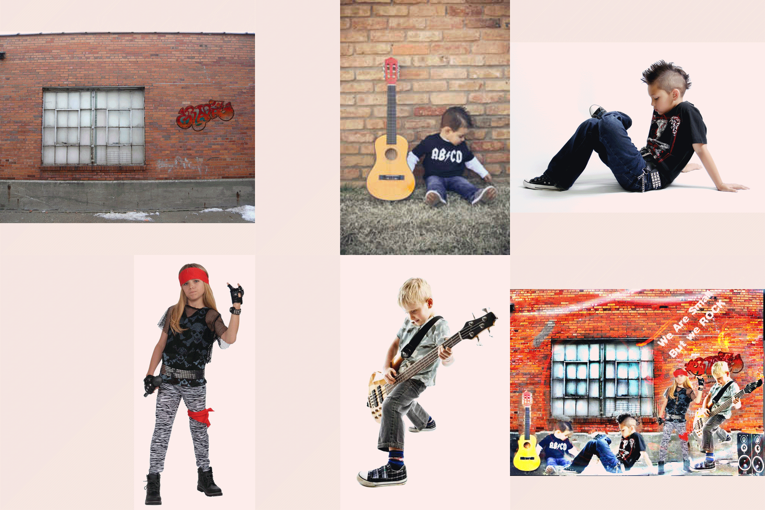
3. I extracted image 16. Punk from it's background and put it in image 11. Graffiti and add more images in the background to make a playful output.


Huwebes, Hulyo 25, 2013


My Experience  in Using Photoshop


                     While extracting the old key using a polygonal lasso at first it was really hard, because honestly speaking it is my first time in editing photos using the photoshop, I somehow edit photos in photoscape. Regarding with this, I feel bad that some classmates are already experts in editing using the photoshop but it does not mean that I will really bend down and get frustrated I try to learned it from myself thinking and flashbacking about sir's lecture then I work hard on it and happily I end up with this output.

                        I somehow get proud and happy about my output, I used black brush for the key to blend up with the 1st layer. I somehow feel afraid of what will happen next but I believed I can do this and I will do every activity that Sir will going to give to us and end up learning and filled with different techniques in Photoshop.

Linggo, Hulyo 14, 2013

There are somehow numerous image file formats that we are using but the top 5 most dominant in use are JPG, TIF , GIF , PNG and RAW Files. 

In this blog, you will going to learn about the description, function and uses of this 5 image file format.


JPG FILES

Digital cameras and web pages normally use JPG files - because JPG heroically compresses the data to be very much smaller in the file. However JPG uses lossy compression to accomplish this feat, which is a strong downside. A smaller file, yes, there is nothing like JPG for small, but this is at the cost of image quality. This degree is selectable (with an option setting named JPG Quality), to be lower quality smaller files, or to be higher quality larger files. In general today, JPG is rather unique in this regard, using lossy compression allowing very small files of lower quality, whereas almost any other file type is lossless (and larger).

Frankly, JPG is used when small file size is more important than maximum image quality (web pages, email, memory cards, etc). But JPG is good enough in many cases, if we don't overdo the compression. Perhaps good enough for some uses even if we do overdo it (web pages, etc). But if you are concerned with maximum quality for archiving your important images, then you do need to know two things: 1) JPG should always choose higher Quality and a larger file, and 2) do NOT keep editing and saving your JPG images repeatedly, because more quality is lost every time you save it as JPG (in the form of added JPG artifacts... pixels become colors they ought not to be - lossy). More at the JPG link at page bottom. 


                                                                    TIF 

is lossless (including LZW compression option), which is considered the highest quality format for commercial work. The TIF format is not necessarily any "higher quality" per se (the image
pixels are what they are), and most formats other than JPG are lossless too. This simply means there are no additional losses or JPG artifacts to degrade and detract from the original. And TIF is the most versatile, except that web pages don't show TIF files. For other purposes however, TIF does most of anything you might want, from 1-bit to 48-bit color, RGB, CMYK, LAB, or Indexed color. Most any of the "special" file types (for example, camera RAW files, fax files, or multipage documents) are based on TIF format, but with unique proprietary data tags - making these incompatible unless expected by their special software.


   GIF Files

was designed by CompuServe in the early days of computer 8-bit video, before JPG, for video display at dial up modem speeds. GIF always uses lossless LZW compression, but it is always an indexed color file (8-bits, 256 colors maximum), which is poor for 24-bit color photos. Don't use indexed color for color photos today, the color is too limited. PNG and TIF files can also optionally handle the same indexed color mode that GIF uses, but they are more versatile with other choices too. But GIF is still very good for web graphics (i.e., with a limited number of colors). For graphics of only a few colors, GIF can be much smaller than JPG, with more clear pure colors than JPG). Indexed Color is described at color palettes (second page of GIF link below).


                                                                         PNG Files


can replace GIF today (web browsers show both), and PNG also offers many options of TIF too (indexed or RGB, 1 to 48-bits, etc). PNG was invented more recently than the others, designed to bypass possible LZW compression patent issues with GIF, and since it was more modern, it offers other options too (RGB color modes, 16 bits, etc). One additional feature of PNG is transparency for 24 bit RGB images. Normally PNG files are a little smaller than LZW compression in TIF or GIF (all of these use lossless compression, of different types), but PNG is perhaps slightly slower to read or write. That patent situation has gone away now, but PNG remains excellent. Less used than TIF or JPG, but PNG is another good choice for lossless quality work.


RAW Files


 are very important of course, but RAW files must be processed to regular formats (JPG, TIF, etc) to be viewable and usable in any way. However, the point is that RAW offers substantial benefit in doing that. The debate goes on, some cannot imagine NOT taking advantage of the greater opportunities of RAW. Others think any extra step is too much trouble, and are satisfied with JPG - my own biased opinion is they just don't know yet. :)

We could argue that there really is no concept of RAW files from the scanner. Vuescan does offer an output called RAW, which is 16 bits, includes the fourth Infrared noise correction channel data if any, and defers gamma correction. Vuescan itself is the only post-processor for these. But scanner color images are already RGB color, instead of Bayer pattern data like from cameras. Camera RAW images are not RGB (the meaning of RAW), and must be converted to RGB for any use

Miyerkules, Hulyo 10, 2013


Hue

Hue" is what we call any color that can be plucked, in a pure state, out of the light spectrum. Think of a rainbow, or that array of colors one gets when using a prism - the results are hues. It all has to do with light and wavelengths thereof.
Confusion creeps in to this definition when speaking of hues of pigmented color, rather than elements of the light spectrum. In this context (pigmented color), the phrase "a hue of blue/red/yellow/insert color here" is often bandied about, when the more accurate terms shade or tint should be employed.

Pronunciation: hew
Also Known As: color
Examples:
"Drawing contains everything, except the hue." - Jean Auguste Dominique Ingres


Saturation

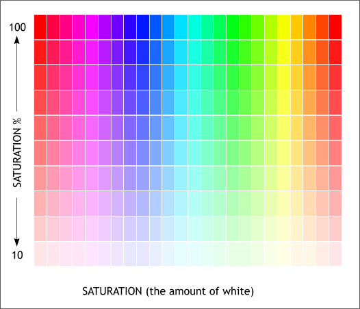
Color saturation refers to how vivid and intense a color is. For example, a display with poor color saturation will look washed out or faded. When a color's saturation level is reduced to 0, it becomes a shade of gray.


Saturation is an expression for the relative bandwidth of the visible output from a light source. In the diagram, the saturation is represented by the steepness of the slopes of the curves. Here, the red curve represents a color having low saturation, the green curve represents a color having greater saturation, and the blue curve represents a color with fairly high saturation. As saturation increases, colors appear more "pure." As saturation decreases, colors appear more "washed-out."


                                                     Brightness


http://www.tomjewett.com/colors/hsb.jpgBrightness is a relative expression of the intensity of the energy output of a visible light source. It can be expressed as a total energy value (different for each of the curves in the diagram), or as the amplitude at the wavelength where the intensity is greatest (identical for all three curves). In the RGB color model, the amplitudes of red, green, and blue for a particular color can each range from 0 to 100 percent of full brilliance. These levels are represented by the range of decimal numbers from 0 to 255, or hexadecimal numbers from 00 to FF.


Lunes, Hulyo 1, 2013

It's all about Colors


"Imagine a world without colors? Dull isn't it ? "

It's in the colors that somehow played how we see the world and appreciate the beauty of any living and non-living things.Colors is also use as a tool in expressing your emotions. In connection with this statement, The using of different colors nowadays will also determine who you are. The rampant using of different colors through years create an own  symbolism of each of color. In this blog, I will going to tackle about "What do each color symbolizes?" and "What are the common applications of colors in deign"


1. BLUE -

    Blue has different symbolism, first we all know that blue is the color of the sea, blue indicates peace and calmness. For girls it symbolizes femininity and purity. It symbolizes also water and water symbolizes life. When we connect it in feelings, Blue can actually be a symbol of loneliness, sadness and depression. For us Ateneans, Blue describe who we are :)

  Color Blue is usually being used in churches and other places where people ecperiencing melancholy goes  because somehow blue symbolizes peace seeing any such thing that is colored blue will surely freshen up your mind. 

    For us teenager, If we are hooked with color blue people will always labeled us as a cool person. 


2. Yellow -

        Yellow associates for joy and happiness. Yellow will always be attractive but too much yellow can lead to distracting the sites. Yellow arouses cheerfulness of a person, it somehow produce a warming effect and is often use to evoke pleasant feelings. 

        We can usually see yellow in resorts and in a sunny area where in using yellow will always be in. Yellow will always be in during summer and will always be the color of those bubbly girls and feminine boy.


3. Red 

  Red usually symbolizes blood, war, aggressiveness  and danger. Red has also it's positive symbolism which are energy, vigor, strength , power, determination, confidence, courage, vitality, passion,  desire and most especially LOVE.

  We can usually see red in different parks that somehow need some attractions to viewers. Red is also rampant especially during Valentines Day.


4. Green-

    As we all know, when we hear the word Green, what comes into our mind is nature. Green also symbolizes freshness, money (in U.S) fertility, hope, maturity and growth.

   Green is usually used by groups  who advocates to take good care of nature, groups who prioritize in bringing up peace in a certain area because somehow green also symbolizes for harmony.  It is also been used in the field of medicine because green can also symbolize healing and safeness.


5. Orange-

    Just like yellow, orange symbolizes happiness. Orange also symbolizes lightness of a certain moment. Somehow it also symbolizes the strength and the creativity of a person. 

   Orange is not rampant in use, especially with teenagers because when you speak about color orange our perception will be people in jail, it's like when you used orange it seems that you escape from a jail. 

    Orange usually used in  parks and sunny area like beach because in those places color orange shines together with the sun.


6. Violet-

    It symbolizes fashion and somehow be a symbolism of rich and elegant people having great power. It can be applicable also with magic and mystery. 

    In catholic cultures violet can represent death and in Muslim  cultures it represent prostitution.


 7. Pink-

      Pink usually symbolizes for unconditional love at the same time it also symbolizes immaturity. Pink is so girlish and somehow silly in the eyes of some. 

    You can usually see pink colors in the girls bedroom, stuffs of girls anything that has connection with girls.


8. White - 
d b   
    White symbolizes purity and virginity. It also symbolizes cleanliness and religiousness of a person. 

   White usually use in peace advocacy. White is clean in the eyes and somehow it brings good vibes to the people.


9. Brown-

  Brown symbolizes earth. It also symbolizes material wealth. Simplicity can also be a symbolism of brown. 


10. Black
 
    Is associated with power, elegance, formality, death, evil, and mystery. It denotes strength and authority, is seen as formal and elegant, and brings forth feelings of fear and the unknown.

   Most rebel teens use color black as a sign of that they are starting to rebel and get wild. It also represent death and loneliness. Before dark was cool but now a days (2013) black is totally out in fashion world most would prefer light colors or neon colors than black.